
RE: SOCIAL MEDIA
scroll to explore
scroll to explore
client
client
United States
United States
platform
platform
Social Media
Social Media
role
role
UX/UI Designer
UX/UI Designer
when
when
2025 - 2026
2025 - 2026
WHAT IS RE?
WHAT IS RE?
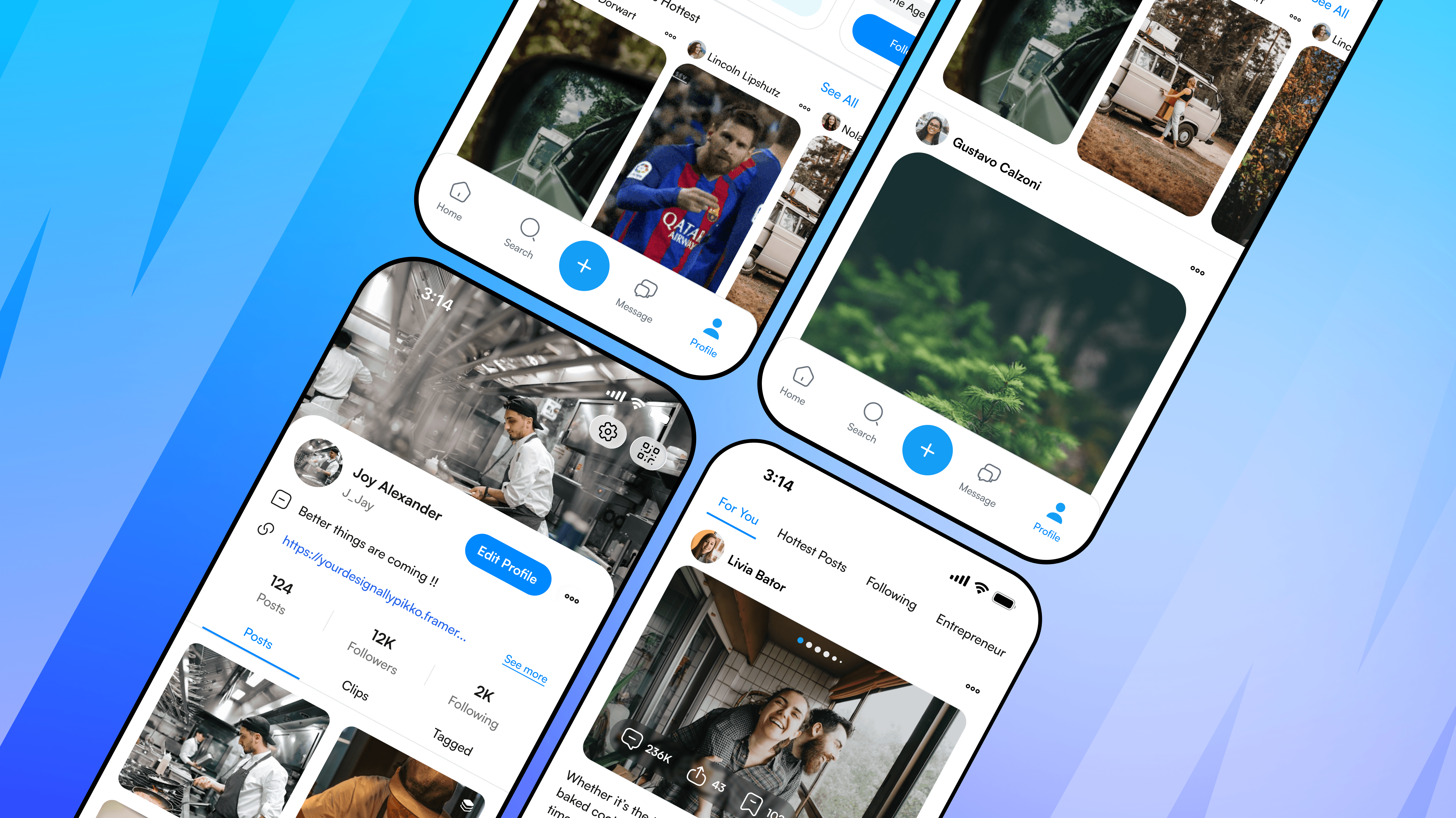
RE: is a modern social media app built to make sharing and discovering content easy on any device. It uses a clean design and smooth animations to keep the focus on real, unedited content. Whether on a phone, tablet, or computer, the app always looks and feels consistent.
RE: is a modern social media app built to make sharing and discovering content easy on any device. It uses a clean design and smooth animations to keep the focus on real, unedited content. Whether on a phone, tablet, or computer, the app always looks and feels consistent.
WHAT RE: BRINGS TO
YOUR SCREEN
WHAT RE: BRINGS TO
YOUR SCREEN
RE: brings you a fast, clutter-free social feed with butter-smooth animations, smart layouts that look perfect on any screen, and a clean design that keeps the focus strictly on real, authentic moments.
RE: brings you a fast, clutter-free social feed with butter-smooth animations, smart layouts that look perfect on any screen, and a clean design that keeps the focus strictly on real, authentic moments.


USER PROFILE INFORMATION
USER PROFILE INFORMATION
The Profile is a clean home for every user's personal content and activity. It organizes posts, replies, and photos into clear tabs so anyone can quickly explore a creator's page. Changing settings or editing your profile only takes a single tap.
The Profile is a clean home for every user's personal content and activity. It organizes posts, replies, and photos into clear tabs so anyone can quickly explore a creator's page. Changing settings or editing your profile only takes a single tap.


PERSONAL HOME FEED
PERSONAL HOME FEED
The Home Feed is the main place where users discover new posts, videos, and photos. Each post is neatly organized in a simple card layout so the screen never feels crowded. Important buttons like like, comment, and share are always right where you expect them to be.
The Home Feed is the main place where users discover new posts, videos, and photos. Each post is neatly organized in a simple card layout so the screen never feels crowded. Important buttons like like, comment, and share are always right where you expect them to be.


KEY LEARNINGS
KEY LEARNINGS
Designing the screens for Re: taught me that great UI/UX isn’t just about making pages look pretty. It’s about building a seamless, living system. By creating modular layouts, strict responsive breakpoints, and a clear motion guide, I turned complex screen flows into a fast, effortless experience. Every pixel, transition, and layout choice was stripped down to its core purpose: to keep the user focused on authentic content without any extra noise.
Designing the screens for Re: taught me that great UI/UX isn’t just about making pages look pretty. It’s about building a seamless, living system. By creating modular layouts, strict responsive breakpoints, and a clear motion guide, I turned complex screen flows into a fast, effortless experience. Every pixel, transition, and layout choice was stripped down to its core purpose: to keep the user focused on authentic content without any extra noise.